
The web runs on forms, and forms leak. For most products the form is not one page among many; it is the page where a customer decides whether the job is worth finishing. Baymard's 2025 checkout benchmark, built from 41,000+ manually scored evaluations across 179 major US and European e-commerce sites, is blunt about how often that goes wrong: 64% of desktop checkouts rate "mediocre" or worse, 63% of mobile checkouts do, and 46% of mobile apps do. Only 2% of desktop sites rate "good," and none rate "perfect"1.
The stakes are concrete. Baymard's long-running cart abandonment tracking puts the global average at 70%1. A CHI paper by Seckler and colleagues found that when forms follow basic usability guidelines, users are almost twice as likely to submit on the first try without errors: 78% one-try submissions on compliant forms versus 42% on forms that violate them2. The upside is just as real. Baymard's research shows the average large e-commerce site can gain as much as a 35% increase in conversion rate from design changes to the checkout flow alone, many of them form changes3.
This article is the anatomy of a form that converts: structure and labels, inline validation, and the design-system discipline that keeps both from drifting.
Why forms fail the same way everywhere
Almost every form failure is a repeat of a small set of documented mistakes. The value of naming them is that each one is checkable in your own UI in minutes.
Structure. Multi-column layouts break the vertical momentum of completing a form. NN/g makes single-column a top recommendation: a single column keeps the user in the flow instead of forcing them to visually reorient between rows2. Baymard's benchmark finds 16% of e-commerce sites still use a multi-column design, which test participants routinely misinterpreted; in one test, the same two-column form was read three different ways3. Keep one field per row, with the narrow exception of short, logically related fields like city, state, and zip code2.
Length. 18% of users have abandoned a cart in the previous quarter because the checkout form looked too long or complicated, and participants in usability tests became intimidated by forms with 10 to 15 or more visible fields3. The fix is not to hide the work; it is to stop asking for it. NN/g's first rule is to keep forms short and remove fields whose data can be derived, collected later, or simply omitted2. Baymard's guidance goes further: use one phone field instead of three, remove fields irrelevant to the current context, hide optional or infrequently used fields behind a link, and autodetect values where you can3. For most checkouts those steps cut the default visible fields by 20 to 60%3.
Labels. Inline labels, where placeholder text does the job of a label, fail the moment the user starts typing because the label disappears. NN/g's guidance is to avoid placeholder text as a label substitute2. Baymard puts labels above fields so they stay visible while the user types, and pairs each with a short description when the input needs explanation: phone format, what belongs in "Address 1," where the CVV lives3. That description is not decorative. Baymard found that without it, test participants guessed, contacted support, or just abandoned3.
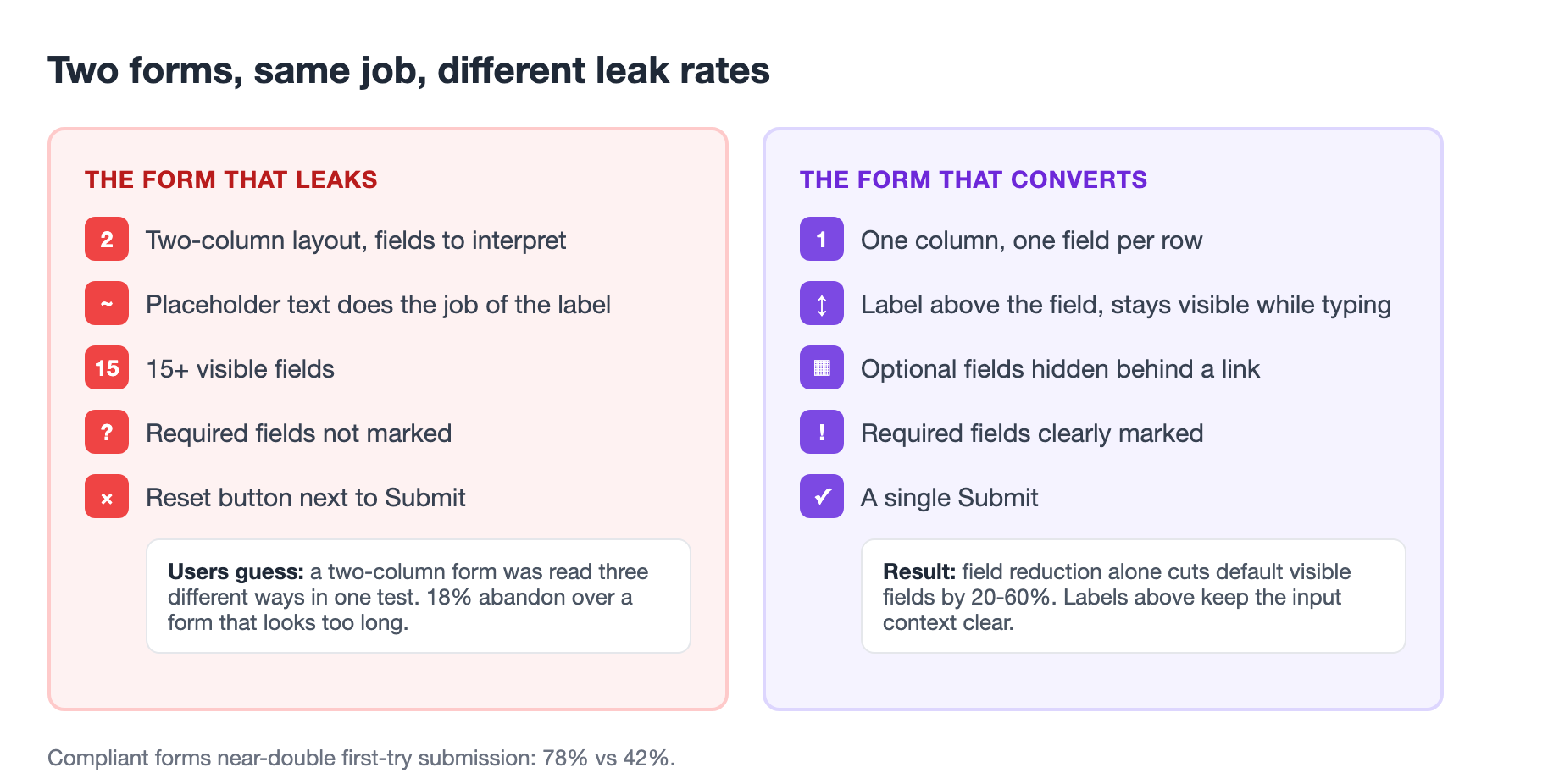
The three failures compound. A two-column form with 15 visible fields and disappearing labels is a wall, not three annoyances. Check your most important form: one column, labels that survive typing, and the shortest field set that does the job?
Inline validation is a mechanism, not a feature
The single most effective change most sites have not made is live inline validation. In Baymard's benchmark, 31% of sites have no inline validation at all, and 32% fail to provide any field validation until submission4. That matters because the worst moment in a form is the one right after Submit: the page reloads, an error appears at the top, and the user must relocate the offending field, re-read its label, and re-enter a value they may have typed minutes ago4. Many forms even reset on submission, forcing users to duplicate work they had already completed4.
Inline validation checks a field as the user types the full value or leaves it, and shows the result immediately4. The payoff is not just fewer errors; it is faster recovery. Because the input is still fresh in the user's mind when the error appears, they correct it in seconds instead of minutes4. In Baymard's tests, a participant recovered from a transposed credit-card number at Wayfair instantly because live Luhn validation caught it before Continue, and a participant at L.L. Bean fixed a missing @ in an email within seconds because the field flagged it as they moved on4.
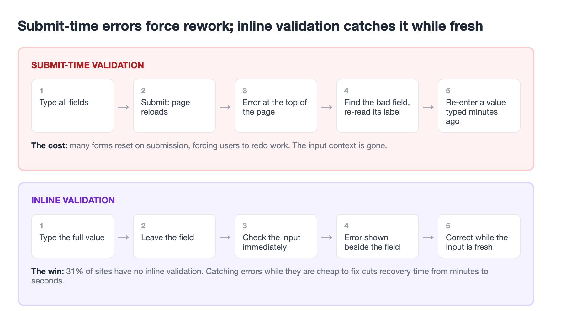
The nuance is in the details. Baymard calls out three things to get right: validate inline but do not over-validate, because a field that flags invalid input the instant the user starts typing, before they finish, is noise; clear the error as soon as the user corrects the input; and where possible use positive inline validation, confirming when input is correct rather than only flagging when it is not4. Inline validation does not replace a real error summary at submission. Users can still try to submit with errors present, so the summary and the inline states must agree4.
Validation state is a design-system concern
This is where form design stops being a page concern and becomes a system concern. Every field can be in one of several states, and each state has a color, an icon, and copy. Decided per page, they drift: one screen uses red for error, another uses an orange the team calls red, and neither pairs the color with the icon and text a user who cannot rely on color needs.
Design systems solve this with state tokens. The US Web Design System defines role-based state color families, including error, warning, success, info, and disabled, each drawn from system color tokens and used across components5. The point of the token is that a component never hard-codes a value; it references error or success, so a change to the palette propagates everywhere and the semantics stay consistent5. If a form's validation states come from the same token set as its alerts and banners, the whole product speaks the same visual language about error. That is the thread this article shares with the token-first approach to design systems3(/blog/token-first-design-systems-2026).
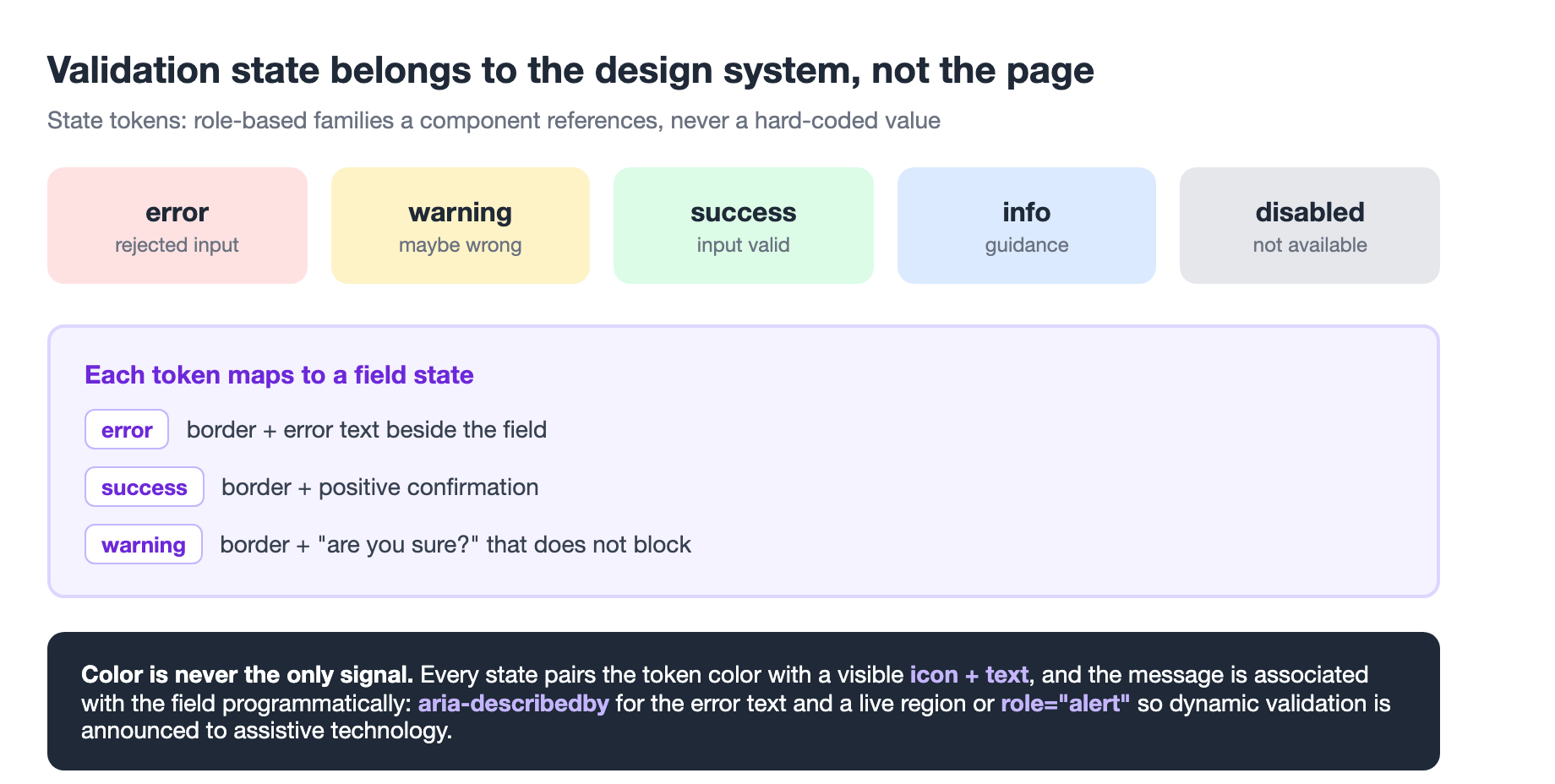
The accessibility requirement is why this has to be systematic. Color alone cannot carry a validation state. Accessible forms pair the color with a visible icon and text and add programmatic hooks: an error associated with a field via aria-describedby, and a live region or role="alert" so dynamic validation is announced when it appears6. The mechanics are equally consistent: keyboard navigation must reach every field, focus indicators must be visible, semantic HTML (a label tied to its input, a fieldset and legend grouping related fields) does most of the work, and ARIA is for the gaps native HTML cannot cover6. The stakes rise every year as accessibility deadlines push toward enforcement6(/blog/eaa-2027-accessibility-deadline).
Together that is a validation pattern that is a usability win and an accessibility contract: inline states from state tokens, color paired with icon and text, and changes announced to assistive technology.
A form pattern you can adopt whole
The pieces assemble into a single repeatable pattern, the same shape headless component libraries ship as a form component. We hit this exact failure in our own delivery pipeline: a designer hands over a form, a developer picks colors off the mock, and three sprints later "error" is three shades, two failing contrast. The fix, put the validation state in the component contract, is the rule we enforce when we ship client UI. Here is the pattern.
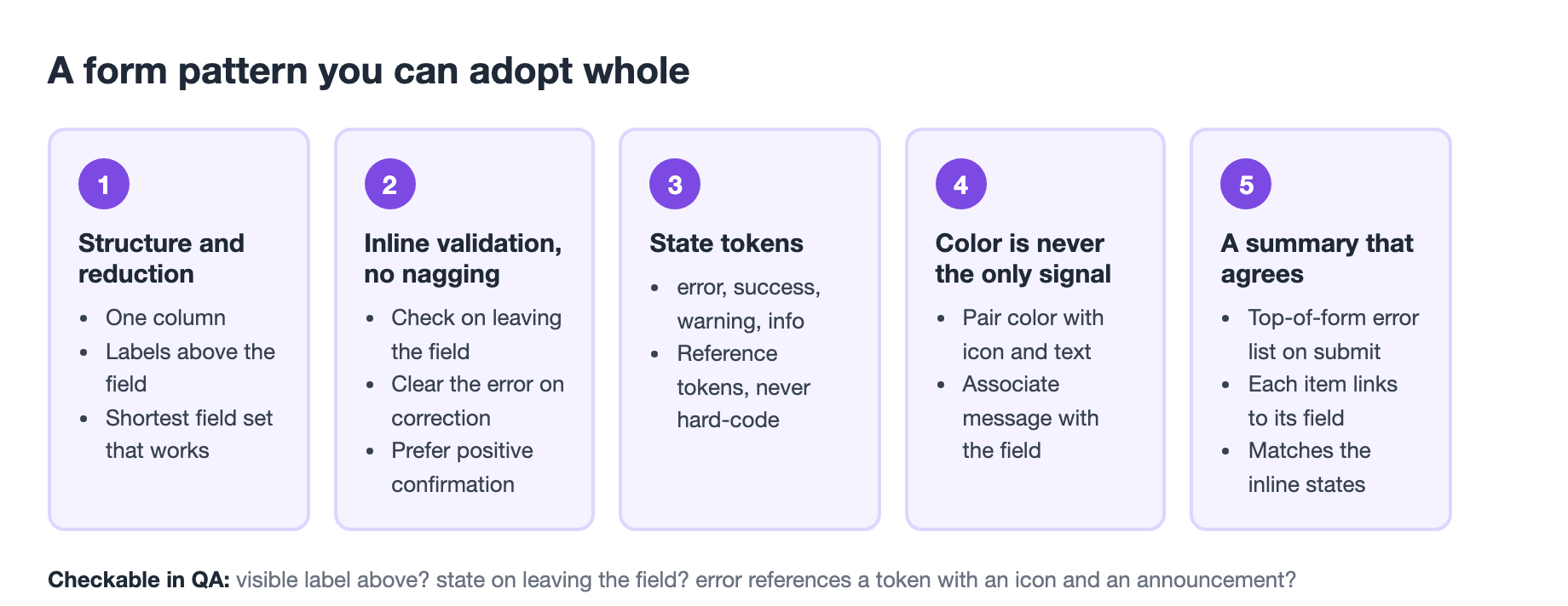
The pattern has five parts.
- Structure and reduction first. One column, labels above, optional fields hidden or clearly marked, and the shortest field set that gets the job done32.
- Inline validation that does not nag. Validate on leaving the field or completing the input, clear the error on correction, prefer positive confirmation4.
- State tokens for the states you actually have. Ship error, success, warning, and info as tokens, and reference them from components rather than hard-coding values5.
- Color is never the only signal. Every error state pairs a token color with an icon and text, and the message is associated with the field programmatically6.
- A summary that agrees. On submit, a top-of-form summary lists the errors and links to each field, matching the inline states4.
Each part is independently testable in a QA pass. Does the field have a visible label above it? Does it show a state the moment the user leaves it? Does the error reference a token, and does it come with an icon and an announcement? Audit your forms against these five and you will find most of the drop-off in the first one, structure and length, because that is where the research says the leaks are31.
The honest limits
Two cautions so this does not read as a silver bullet. First, the conversion numbers are e-commerce-shaped. The 35% figure and the 70% abandonment rate come from retail checkouts31. A B2B onboarding flow or an internal tool is not a checkout, and the exact lift will differ. The mechanisms still apply; size your expectations to the funnel you actually have.
Second, inline validation is not free. It shifts work from one validation pass on the server to logic that runs as the user types, and every rule you ship has to avoid false negatives: the validator that rejects a valid email because it contains a plus sign, which Baymard flags as a real failure3. A warning, an "are you sure?", is often the right response to input that might be wrong but is not invalid. Validation should not stop a user who is not wrong3.
The takeaway
Forms are the interface pattern with the most direct line to revenue, and the one most teams under-invest in because a form looks easy. The evidence says otherwise: most checkouts rate mediocre or worse, 70% of carts are abandoned, and compliant forms roughly double first-try success12. The fix is not exotic. It is a short single-column form with labels that survive typing, inline validation that catches errors while they are cheap to fix, and validation state treated as a design-system token. That combination is checkable, auditable, and the difference between a form that finishes and one that leaks.
Sources
-
Baymard Institute, "Checkout UX 2025: 10 Pitfalls and Best Practices" (updated Nov 25, 2025). baymard.com ↩ ↩2 ↩3 ↩4 ↩5
-
Kathryn Whitenton, "Website Forms Usability: Top 10 Recommendations," Nielsen Norman Group. nngroup.com ↩ ↩2 ↩3 ↩4 ↩5 ↩6 ↩7
-
Baymard Institute, "Form Design: 6 Best Practices for Better E-Commerce UI." baymard.com ↩ ↩2 ↩3 ↩4 ↩5 ↩6 ↩7 ↩8 ↩9 ↩10 ↩11 ↩12 ↩13
-
Baymard Institute, "Usability Testing of Inline Form Validation." baymard.com ↩ ↩2 ↩3 ↩4 ↩5 ↩6 ↩7 ↩8 ↩9 ↩10
-
US Web Design System, "State color tokens." designsystem.digital.gov ↩ ↩2 ↩3
-
AccessibilityChecker.org, "5 Best Practices for Creating Accessible Forms." accessibilitychecker.org ↩ ↩2 ↩3 ↩4